Friday, 10 May 2013
Wednesday, 24 April 2013
Sunday, 14 April 2013
Monday, 18 March 2013
Friday, 15 March 2013
Monday, 11 March 2013
Wednesday, 30 January 2013
Deprived Film Poster Analysis
Deprived Poster Analysis
Examine the film’s title. What does it suggest?
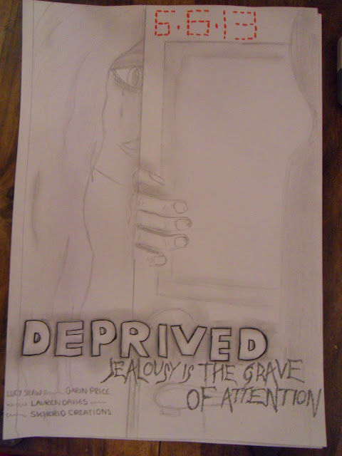
The title Deprived suggests that the girl in the main image is being deprived of something important and it is obviously causing he distress by the tears in the picture.
What is the main image (key art)? It is simple or multi-layered? Does it raise any questions about the film? Does it suggest or reinforce a central enigma (a mystery or unanswered question)?
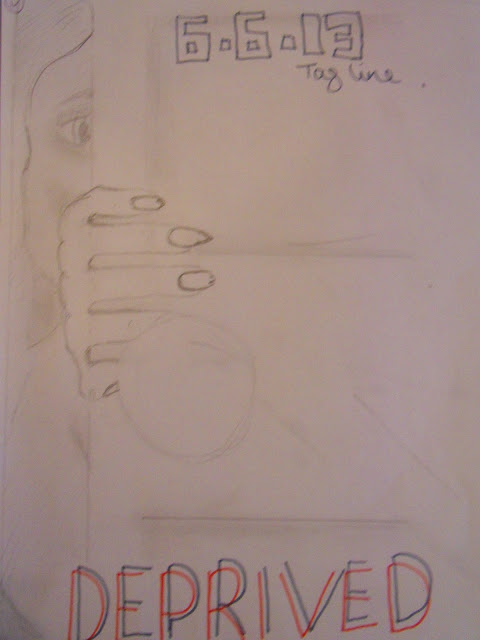
The main image is of a girl crying hid behind a door but looking towards a layered photo of a being that is casting a shadow onto the door. This suggests that she is hiding from who/whatever is casting the shadow. The main image leaves us asking
What is casting the shadow?
Why is the girl hiding from it?
Why is the girl crying?
Does the poster employ iconography (identifying features) of a particular type of narrative or genre? Does it suggest a single genre or more than one?
There is no iconography used on this poster. However the tag line is in a ‘scary’ font this automatically related to the horror genre. Also along with the tears on the girls face also relates to fear and the horror genre.
Who are the film’s stars? How prominent are their names? (There are usually one or two main stars-- What difference might this make?)
In the billing block there are three actors names this makes the film have an automatic USP if these actors are well known to the audience.
Does the poster show the stars? Do they appear similar to other circulated images?What aspects are similar, what are different?
The only actress shown is the young girl, she is the main image therefore we presume that she is the main character and the first actress named in the billing block. The only other figure in the image is a silhouetted figure therefore we are unaware of the who the actor is.
If the main stars/actors are shown consider:
How they are positioned/illuminated. In Profile? Partly obscured by shadow?
Their facial expressions
Their style of dress
(if there is more than one) their relationship to each other.
Only one character is shown she is positioned behind a door, peaking through the gap showing us that she is hiding, also the fact that she is partly obscured by the shadow shows that she is hiding in the dark from something. Her facial expressions show that she is scared and only showing half her face shows that shes cowering away from something.
Does the poster carry the movie’s tagline? What is this? Does it suggest more than one meaning?
The movie’s tag line is ‘Jealousy is the grave of attention’ tells us that there is an underlying theme of jealousy in the film. Also ‘grave’ could suggest that there is going to be death in the film.
What are the credits on the poster? Find out if the producer and director are well-known. Do any other credits help to sell the film to a particular target audience?
The producers name is Skirrid Creations this is shown in the billing block.
What kinds of experience and pleasure are being offered to audiences? What is the film’s appeal? Who does the target audience appear to be?
The target audience appears to be between 15 - 30 both male and female, males are expected to enjoy horror genre films more than females however the fact that the main character is a female will attract more female audience members as they may be able to relate. The audience are left with an intellectual puzzle whilst looking at the poster as the images leave a few questions unanswered.
What does the film appear to have that marks out its difference from other films (the combination of stars, the concept)? Is the film high concept? Does it have a unique selling point ?
The combination of stars acts as a USP as it will draw in a wider audience.
Wednesday, 9 January 2013
A Critical analysis of the Animatic Process of my group’s Film Trailer.
1. Define what an animatic is what its function is.
The wikipedia definition of animatic is a simplified mock up of still images and rough dialogue. I think it’s using a series of still shots edited together to create brief plan of the final product, we create animatics to realise what will work and what wont work.
2.Explain the process of an animatic and how it works.
Creating an animatic is quite a lengthy process it requires you to first create a rough storyboard of the chosen shots you want to take. Then after creating the story board as a group it is important you come up with a shooting schedule so that some shots that need more that one of the group members can be taken as a group. Also before creating the animatic you need to decide what;
Props
Extra actors/actresses
Costumes
When creating the animatic its important to have regular meetings with your group to ensure that everyone has an input and gives their opinions. After taking the shots they will be edited together in the editing suite along with audio and transitions.
3. How did you create and develop the narrative of the animatic, post your original storyboard on your blog and discuss how you moved from deciding on this to making the animatic.
We followed the storyboard by keeping the equilibrium and series of events in the same order. However some shots were changed for example angles and character positions, we did this to make it more appealing to the eye. We also asked for other peoples opinions outside of the group.
4.Evaluate your experience during the actual making of your animatic.
We could not of created an animatic without the storyboard as we wouldn't have a point of reference or a structure.
How did you use your storyboard to organise your schedule?
We used the the storyboard to organise how the plan would be set out and how long each shot would last.
How many different shoots did you have?
We went on 11 shoots in total.
How many locations did you have?
Altogether we had 3 separate locations; a classroom, the woods and a lake.
What props did you use?
Our main props were a torch, a car and a small fire.
How did you choose your actors?
Garin is the only male in the media group and is remotely brave so he was chosen to be the main heroic figure. Amy is a very quiet person so we thought she would place well as the vulnerable timid charcter. Lauren is a very dramatic person so we thought she fit the description of her character. Tom is a very loud and talkative person just like the character and Lucy (myself) I look the youngest therefore I was chosen to play the younger sister character.
What decisions and revisions did you make as a result of each shot?
There were several shots that were changed for example; we changed the three shots of the three girls looking lonely.
Were there any shots that you were unable to do and why?
The shot were Emily climbs out of the lake, this was discarded as of the weather conditions and health and safety.
Were there any changes or creative improvements you made and why?
Timings were changed, some shots were discarded and some angles were changed, just to make the animatic appealing to the eye and not as long.
6.How did you choose the length of the shots?
By using other trailers as examples and using our storyboard
7.Discuss the choice of titles and the use of font and style to create meaning?
Downloading fonts such as ‘scratch and demons’ to reflect our genre. Red was used to represent fear, love and blood.
8.Evaluate your choice of soundtrack music, how does it affect the mood of your film trailer and the pace of your editing?
Our soundtrack choice was a mixture of chimes with high piano notes, this places fear in the audience and gives a creepy effect.
9.How does your completed animatic appeal to your chosen target audience?
It appeals to the target audience as it features activities and features that appeal to the age range targeted such as summer, camping and friends. Horror genres are usually stereotyped for males so we added in a romance story to appeal to the female audience.
10.what would you change/improve before you begin making your actual moving image trailer? Consider for example:
Length and order of shots
Location and mis-en-scene features
Editing of narrative
Music choice
I think I would give away more of our storyline to our narrative and we need a soundtrack that creates a better ambience for the audience.
11.Choose 5 key images from your completed animatic to post on your blog and evaluate how they make meaning for your target audience.
.JPG)
This is a picture of the youngest character with a slightly distorted face and covered in water. This was distorted to create enigma for the audience as the attempt to identify what or whom it is. It also creates fear in the target audience as its unknown why she looks that way.
.JPG)
This shot of a girl looking isolated and alone in the dark, this creates fear in the audience as they are unaware of what is around her and what she is looking at.

This shot of a couple holding hands in the dark shows safety and romance which is very common in the age of our chosen target audience.
 This is a medium two shot of two boys fighting they are the same age as the target audience, which could make this scene relatable in some ways.
12. Consider your role during this process and how you will contribute to the moving trailer.
I helped by being a character in the trailer and I helped in the editing suite, I also took part in taking photos.
Subscribe to:
Comments (Atom)


.jpeg)
.jpeg)
.jpeg)
.jpeg)


